
Absolute Luminances
Here’s the next in a series of analyses of the Leonid data. This one is not particularly revealing; it is a histogram of the absolute luminances of the Leonids:
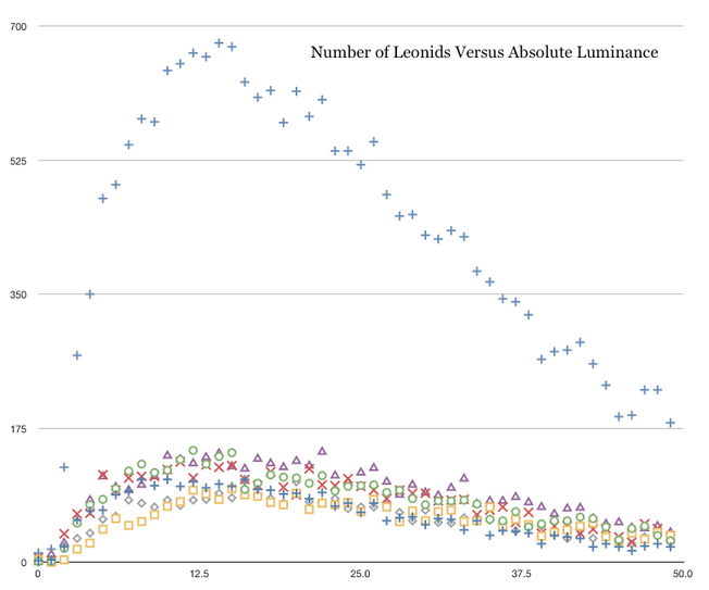
This is actually quite easy to understand. The horizontal axis represents how bright each Leonid actually was (regardless of its distance from the camera).The scale is arbitrary; there is no standardized measure of luminance for meteors, and besides, the image intensifiers used have their own spectral response curves that render any such absolute comparison meaningless. What this shows is how bright the Leonids were on the light scale produced by the image intensifiers. The mass of symbols along the bottom represent the results from each individual camera; the higher blue crosses represent the summation of these results. As you can see, there is a characteristic brightness for most Leonids (represented by the peak value) which then falls off linearly. We cannot know, however, how much of the falloff at the right end of the histogram is due to the intrinsic properties of the Leonids and how much is due to the selection effect (among the faraway Leonids, we only see the bright ones, so they are overrepresented in this sample.) There is, however, a scheme we can use to get around this problem: we can look at the absolute luminance distribution for Leonids at the same range. Here’s that histogram:
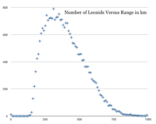
As you can see, the peak is at about 310 km, with the band between 260 km and 360 km being fairly flat. That provides us with a good sample to use. So I compile a histogram of absolute luminances of all Leonids at ranges between 260 km and 360 km. That histogram looks like this:
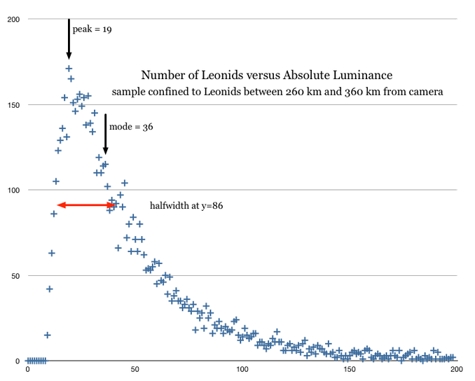
This distribution, you can readily see, is much more narrowly confined than the first histogram; it is obvious that selection effect played a large part in spreading the first distribution so broadly. The peak of this distribution is at an absolute luminance value of 19 (but remember, this is in arbitrary units) and the mode lies at 36. Half of all the Leonids in this distribution fall within the range 13 - 37. In other words, 50% of all Leonids fall within a dynamic range of 3, heavily lopsided toward the top end. At the same time, the top 1% of the Leonids are 9 times brighter than the peak value.
There’s a general law for particle size distributions called the power law:
n(D) = T * D ** -s
When I attempt to fit that power law to this distribution, the best fit is obtained with the values T=11712 and s=1.36, with the following result:
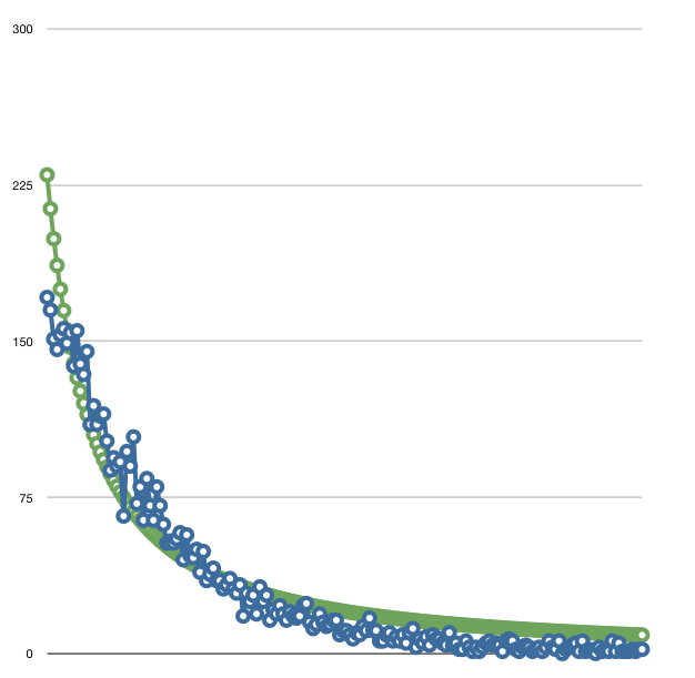
Note that the data doesn’t quite fit the power law; there’s a consistent overage at the ends of the curve and a consistent underage in the middle. This means that the power law, while a close fit, doesn’t exactly fit this data. Of course, we must ask ourselves whether we expect absolute luminance to be commensurate with particle size. That’s a big assumption. While it is likely that there’s a relationship between the two (bigger particles are likely to be brighter), there are other factors to consider, such as the internal structures of the particles (how solid they are).
What does it all mean? I really don’t know.