
June 11th, 2022
I have long preached that the fundamental design description of every program is its verb list: the list of actions that are available to the user. Big, complicated programs have long verb lists; simple programs have short verb lists.
The first hurdle the software designer must face is deciding how the verbs in the verb list will be expressed by the user. In the good old days, there wasn’t any choice to make; the only input device was the keyboard, so all inputs were expressed as keypresses. In their simplest form, these were single keypresses, such as you can see in the Atari DOS from 1982:
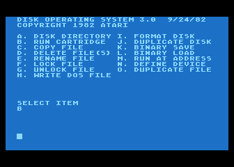
There were only 15 possible commands, so each command was executed merely by pressing the appropriate key.
However, more complex programs required more complex inputs, so multicharacter inputs — strings of letters — immediately came into use. These were cryptic sequences of characters that only hardcore programmers could remember. These were called “Command Line Interfaces” and were the standard until 1984.
Some of the early personal computers, most notably the Atari computers, came equipped with simple switched joysticks, and some Atari software used these joysticks as input devices. However, no general system for utilizing joysticks ever developed from this opportunity.
The command line interface suffered from a severe flaw: the user had to memorize every command that the interface offered. Imagine using the Atari DOS without having the displayed menu to remind you how it worked. This wasn’t a problem before personal computers came along, because all computer users were professionals who could afford to dedicate the time to memorize the requirements of the big mainframe computers. Most of the early personal computers used command line interfaces, because there weren’t any alternatives. The IBM PC, introduced in 1982, used just such an interface.
Personal computers were marketed to non-professionals, and that created a problem: non-professionals had difficulty memorizing the many complicated text strings required of a full-featured operating system. They could memorize a handful of commands, but even the 15-command verb list of the Atari DOS was too much for most people to memorize. This was a major obstacle to the progress of software.
Realizing this problem, Alan Kay at Xerox PARC (a research outfit in Palo Alto, California) and his group invented a radically different approach: the Graphical User Interface. Xerox’s Alto computer using this technology was far too expensive to have much effect, but Steve Jobs at Apple Computer saw it during a visit to Xerox PARC and instantly grasped its value. He set up a new group at Apple whose assignment was to build a personal computer using the graphical user interface. Their result, the Lisa, was a ground-breaking achievement, but at $10,000 in 1983 (equivalent to $27,000 in 2022), it was far too expensive to reach many people. Mr. Jobs had a second group design a cheaper version of the Lisa, and it was released in 1984 as the first Macintosh. Even the Macintosh, at $2000 (equivalent to more than $6000 in 2022 dollars), was horribly expensive. Nevertheless, the graphical user interface (GUI) was far more powerful than the command line interfaces of the day, and that advantage insured the success of the Macintosh.
The power of the GUI is most easily understood in terms of the verb list for a program. GUIs are easier to learn than CLIs:

One way of assessing this difference is to estimate the maximum number of verbs that most regular users learn for programs using the two interface types. For command line interfaces, I’d guess that to be about a dozen verbs. That is, most users seem content with their grasp of the CLI after they have learned about a dozen verbs — including all the formatting requirements for each verb. They slow down in their efforts to learn new verbs. Of course, many of the readers of this page, being more professionally involved in software, will have learned many more than the handful of verbs that regular users learn. Yes, a professional knows a lot more than an amateur. But it’s the amateurs who provide the billions of dollars that drive the industry forward.
We have a better way to estimate the number of verbs that regular users learn with GUIs. The simple programs that came with the early Macintosh — the Finder, MacWrite, and MacPaint — all sported less than a hundred verbs. As software for the Macintosh grew more powerful, and hence more complicated (more verbs), users began to have difficulty learning all the verbs in a program. They flooded customer support telephone lines to software companies, wanting to know how to use the programs. As customer support departments ballooned in size and cost, software companies became desperate in their search for a solution.
A number of software companies adopted a novel approach. They split their offerings into two versions: a less powerful, cheaper version with fewer verbs, marketed as “easy to use”; and a more powerful, more expensive version with more verbs, marketed as “the ultimate in power”. We saw this twin approach with word processors, spreadsheet programs, paint programs, and drawing programs. A good example was ClarisWorks, and integrated package of programs which Apple later bought and renamed “AppleWorks”, replacing a more primitive version for the Apple II.
Around the turn of this century, I spent some time compiling verb counts for many different programs, and I discovered a striking pattern. The “amateur” versions of most programs had only about a hundred verbs. Meanwhile, the professional versions had about 300 verbs. There weren’t many programs falling in between these groups. I once gave a homework assignment to the students in a class I taught: they had to count the number of verbs in Microsoft Word, one of the “professional” programs. In a class of fifteen students, no two counts matched; the counts ranged from 300 to 350. That’s how complicated the user interface was.
My conclusion from this study was that the GUI had a natural upper limit of about a hundred verbs. You could push it harder; the professional programs were all usable, despite having upwards of 300 verbs.
The Internet rides to the rescue, and ruins everything
It was at this time (around the year 2000) that the Internet intervened in the process. Customer service departments for software companies suffered from long waiting times, and people turned to the Internet for help. User help groups quickly appeared, and you could get an answer to your question within 24 hours. These help groups were so successful that software companies slashed their customer support departments and set up help groups on their websites. Customers got fast answers, software companies saved money, and everybody lived happily ever after.
Well, not quite. Relieved of any incentive to keep their programs easy to use, the user interface standards at software companies were relaxed and eventually abandoned. Many programs these days have hideous user interfaces, replete with design blunders that would have destroyed the reputation of a software company in the 1990s.
The user community is now divided into two groups that have little to do with each other. The first group is composed almost entirely of young enthusiasts. These people eagerly read all the latest techie news on the Internet, all the new product announcements, gushing reviews, etc. When they get a new toy, be it software or hardware, they play with it endlessly, learning all the clever tricks that it can play, and sharing their discoveries on their discussions groups. They quickly learn lots of other tricks from other enthusiasts.
The second group comprises unsociable users who just want to get things done with their digital equipment. They see their devices as tools, where the first group sees them as toys. These people are older and less patient. They have specific goals in mind and want to get those goals achieved as quickly as possible with minimum hassle. I was in the first group in the 70s, 80s, and into the 90s, but in this century, I am definitely in the second group.
The first group drives sales; they’re eager to buy the latest toy, whereas the second group sticks with its old equipment until forced to upgrade. I am writing this on a five year old Mac, and own an iPhone 8. I see little reason to upgrade either machine. Accordingly, the industry caters to the first group. This group doesn’t need good user interface design; you can shove unusable crap at them and they’ll gobble it up. They revel in their knowledge of special tricks few others know. Planting hidden features and Easter eggs into software is for them a feature, not a bug.
Here’s how bad software has become
I spent several hours going through the basic software on my iPhone 8. I excluded any apps that I had downloaded, considering only the apps that come installed with iOS. There’s simply too much stuff here to present in a reasonable amount of space, so instead I offer a small snapshot. Here are the first three levels of a narrow tree of verbs for my iPhone:

Of the numerous apps on the iPhone, I chose what is probably the one endowed with the greatest number of subsidiary elements: Settings. That app has 51 elements addressing the core iOS apps. Next, I went through each of those 51 menu items and counted the number of subsidiary elements it contains; that amounted to 584 secondary menu items, for an average of 11.45 secondary menu items per primary menu item. Just for kicks, I listed in the second column the secondary menu items of just two of the primary menu items. In the third column, I showed the tertiary menu items of just two of those items in the second column.
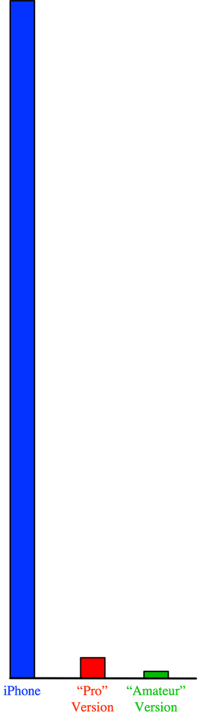
The point of this image is that the Settings app on the iPhone probably contains over a thousand verbs. And that’s just the Settings app! I guess that my iPhone contains, in all, over 10,000 verbs. Contrast that with the hundred verbs typically used in an amateur program on the Mac and the three hundred verbs in a “professional” program back in the 1990s. Here’s a simple bar chart showing the difference between these:
The same problem plagues software on my Mac. For example, the Safari web browser on my Mac boasts 85 verbs in the primary menus. The secondary menu items are mostly for setting personal preferences; I’d guess that there are perhaps a hundred of those. There are also the various doodads in the window itself, like these:

All this for a browser?!?!?!
Let’s not forget the other digital devices in my life: the television, program recorder, DVD player, and the car. I have four remote controls for my television and its paraphernalia, boasting about a hundred buttons, few of which I know anything about.
Put this all together and my digital life encompasses about 20,000 verbs. Compare this with the English vocabulary of the average American: about 30,000 words. (There have been many studies of vocabulary size, with results ranging from 20,000 words to 40,000 words. I chose the middle of the range.) In the computer age, your digital vocabulary is almost as large as your language vocabulary.
Why should we have to learn two languages?
It’s hard enough mastering one language. My personal vocabulary is considerably larger than that of most Americans, as I am sure you can confirm from painful experience. Our English language is quite sufficient to express almost anything one would want to say, so why are are jumping through all these hoops learning the cock-eyed languages that bozos at software companies concoct with zero knowledge of linguistics and little knowledge of user interface design?
Here’s an example of what I mean. A month or so ago my iPhone suffered a software malfunction. I did something — I still have no idea how I managed this — that locked the iPhone into a mode where it refused to rotate the screen in conformance with the tilt of the body of the iPhone. In normal operation, if you rotate the body of the iPhone, the screen rotates along with it, reconfiguring itself to fit the altered geometry. The end result is that, no matter how you rotate the iPhone, the screen display is always upright and easily readable. But somehow mine was stuck.
The conventional (wrong) way to fix the problem
I figured that it was some sort of preferences problem, so I went into the Settings app — the one mentioned above with 51 categories. I went through every one of those damn categories and could not find anything referring to the tilting problem. So I went onto the Internet and searched for a solution. I found several, but they were for an older version of iOS and didn’t work on my version of iOS. I curse to hell those idiots at Apple who decided to rearrange the user interface in order to render obsolete earlier versions. After some more searching, I found a completely different explanation: I had to “swipe” upward from the bottom of the screen. I’m familiary with the swipe operation, but I deem it to be obnoxious and poor user interface design. Moreover, it didn’t work on my iPhone. I gave up.
Fortunately, a week or two later, my wife and I went into the AT&T store to inquire about purchasing a new iPhone — Kathy thought it might be worth considering. While there, I asked the lady how to fix the problem with the screen rotation. She explained that you simply swipe upward from the bottom of the screen. I challenged her to show me how to do it — and she did it without hesitation. Flabbergasted, I watched her closely as she did it several times for me. It turns out that there’s a narrow band at the VERY bottom of the iPhone screen that does respond; it’s the section that I have highlighted in green in this image:

That zone is a tad more than 2 millimeters high on my iPhone. If you do succeed in swiping from a starting point inside that green zone, then you get something looking approximately like this:
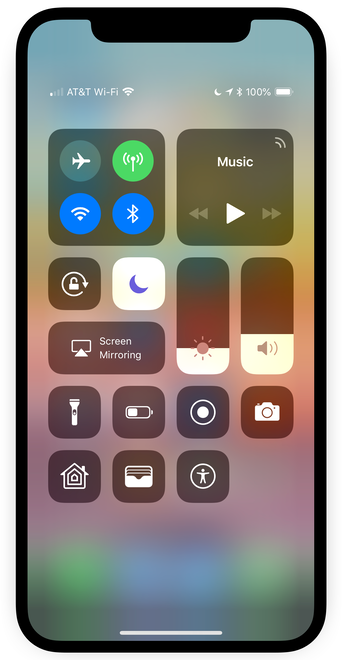
One of these icons allows you to lock/unlock the screen from rotating with the iPhone. Good luck guessing which icon does it; I couldn’t find anything on the Internet explaining which one it is. The lady at AT&T showed me.
The right way to handle the problem
Here’s how the problem would be handled on a properly designed system:
Chris: Siri, my iPhone display doesn’t rotate with the iPhone.
Siri: Do you want your iPhone display to rotate along with the iPhone?
Chris: Yes, please.
Siri: OK, I’ve changed it.
Screw all those idiotic icons and swipes and drags and 3D presses and menus. Just TALK to the damn thing! That’s how humans communicate with each other; that’s how humans should communicate with computers.
