
Well, I did it again. I have done this all through my career; it’s a bad habit I just can’t shake. I just can’t help thinking about screen layout in terms of information communication as opposed to an aesthetic expression. I count pixels without seeing — literally — the big picture.
Many months ago, when Alvaro Gonzalez suggested a layout inspired by the aesthetics of comic books, I immediately recognized its superiority over my own design, and enthusiastically endorsed the idea. But now, as I attempt to redesign the layout, I drop straight back into my old habits.
I have therefore made several decisions. First, I’ll specify a screen larger than the 1389h x 714v that was the minimum necessary for the earlier layout. Second, I shall free up some screen space for aesthetic purposes by removing some unnecessary space used for the speech bubbles. Here is the result of my thinking:
(As previously, this is scaled down from 1600h to 900h, to fit into my website page specification.)
Here is a portion of the same screen, shown in actual size:
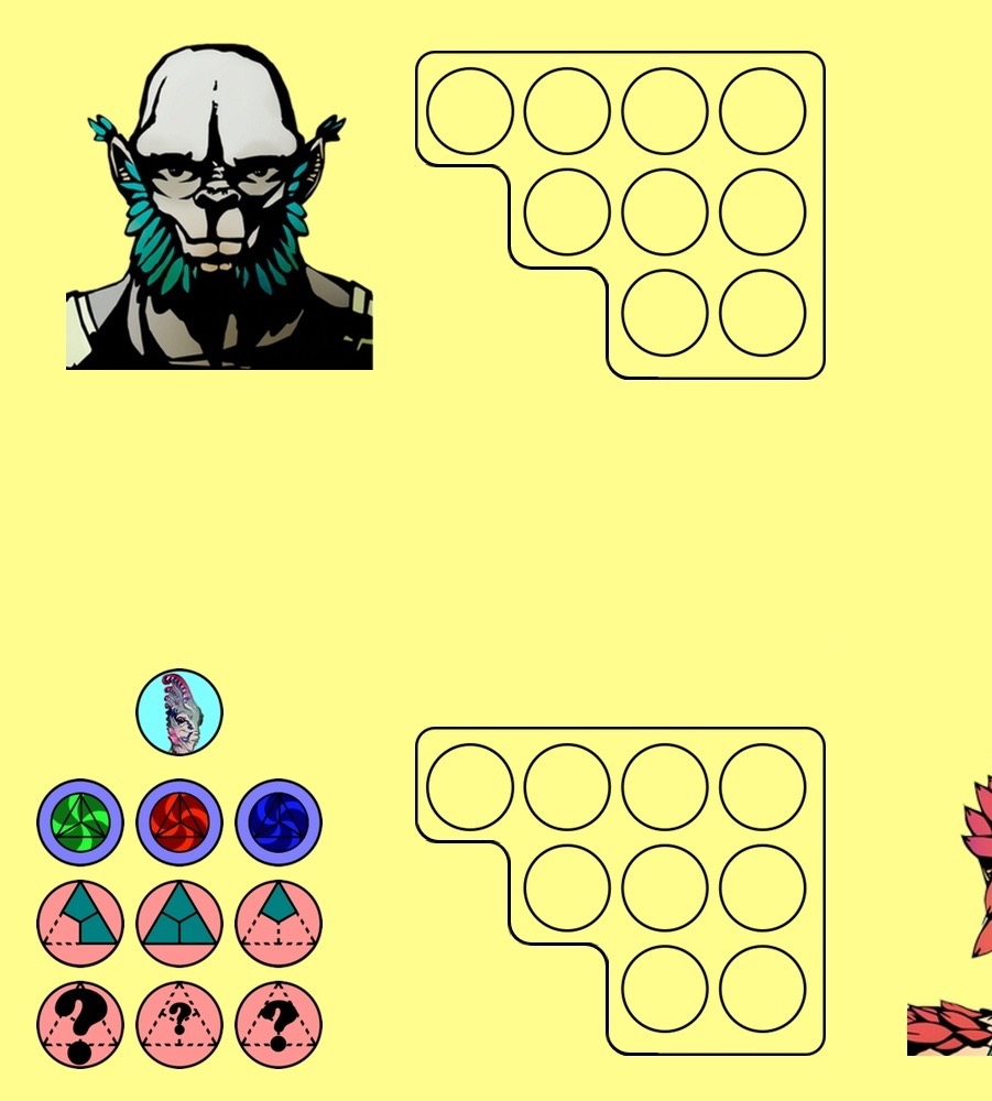
What looks like free space here is meant to give Alvaro some room to spread his artistic elbows.