I have done no work on Siboot for nearly three weeks now; a number of other priorities intruded into my time. But at long last I am making some time again for Siboot. One good thing about stepping away from a project for a while is that you realize that some things you had been taking for granted might not, after all, be right.
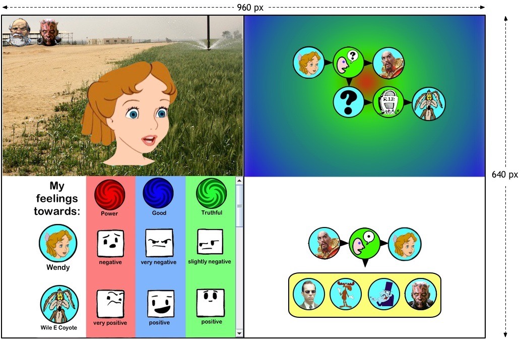
That happened to me with the simplest of issues: window size. All along I’ve been designing for a 960h x 640v window; that would fit onto the larger smartphones. But then I asked myself a question: am I designing Siboot to sell a zillion copies, or am I making my last-gasp effort at getting interactive storytelling working? The answer to that question should be obvious, so why am I worrying about fitting into a narrow screen? More than 90% of all the display sizes being used on the Internet exceed 1300h x 768v, so I should design for that display size, which means that I could have a window size of 1200h x 700v. That’s a big increase in window width, and I should use it. Here was my previous screen layout:
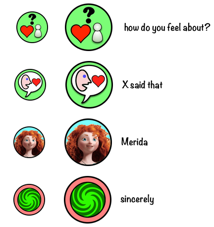
This layout wastes lots of space. In particular, why do I need to keep my icons so small? They are 64 px in diameter and the connectors are 16 px wide. My experience has shown that the widest sentences use only 4 icons; with three interconnecting arrows, they require only 304 horizontal pixels. If I used a 1024h window, I would have a total of 512 pixels available for the sentences; if my icons were 96 pixels in diameter, and connectors were 24 pixels wide, then the widest display would consume only 456 pixels horizontally. Here’s how the same icons at different sizes look:
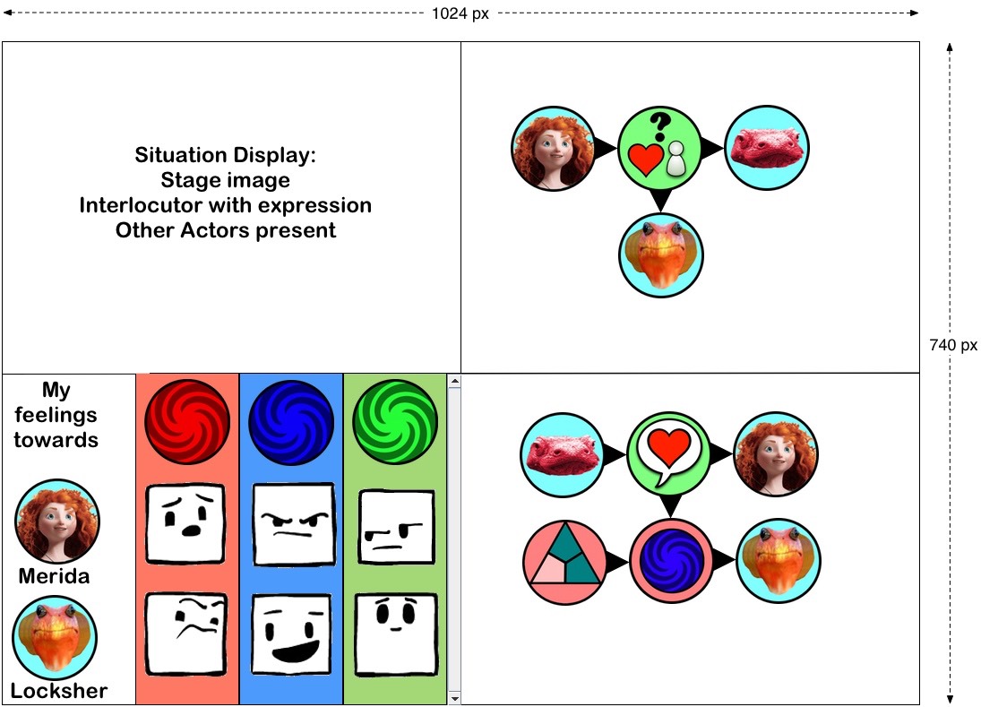
It makes quite a difference, doesn’t it? Here’s the basic layout of the new display system; the image is actually smaller than actual size in order to fit into this narrower page: