
There have been many, many attempts at building logographic languages; here’s a survey of a few of those systems. Most people direct their attention to the symbols themselves; before we begin, I want to direct your attention to some general issues
Icon size and screen real estate
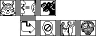
The earliest icons use on the Macintosh were just 32 x 32 pixels, and were black and white:
Icons grew in size and color depth, but screen sizes still place a limit on the size of the icons. I figure that the maximum usable size is 128x128:
Smartphone screens can be very small, but I think that we can safely design for a screen size of about 1400x1000 pixels; this would give us enough screen real estate for our sentences.
Geometrical grammar
A
particular advantage of logographic languages is that they work on two
dimensions; all natural languages operate in a single dimension, which
can involve all sorts of complex trickery to enable a word in one part
of a sentence to refer to a word appearing earlier in the sentence. Here
is a sentence appearing in my Siboot game in 1986:
“Vetvel tells Gardbore that nobody betrayed Zubi.”
This was a rather clumsy structure, especially the right-turning arrow for the word ‘that’. I developed a better geometrical structure for the modern version of Siboot:
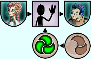
“Camiggdo greets Koopie with much sincerity.”
Here the tiny arrows denote how words modify each other. The use of geometrical structures is constrained by screen size, as the largest possible sentence must have its own dedicated space. Thus, the structure shown above, using just 3 columns by 2 rows, requires 544h x 354v of screen space. A dialogue requires, at the minimum, space for two such sentences. If placed side by side they would consume 1088h x 354v of screen space. Expanding the sentence space to 4 columns by 3 rows would expand this requirement to 1450h x 531v — about half the available space for our specified screen size.
Word Types
Another
big advantage of geometric grammar is that words can be provided with
visual cues helping to indicate their meaning. While some logographic
writing systems such as Chinese and Egyptian hieroglyphics used such
cues, there was no overarching theoretical structure behind these
systems. We have the opportunity to provide that architecture, and I
believe that the best approach is to use visual cues to indicate the
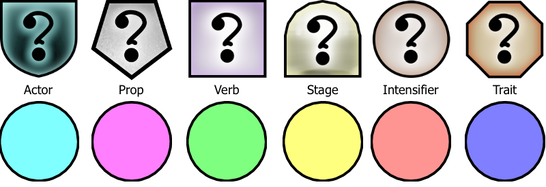
type of each word. (See Word Types).
The two most useful such modalities are shape and color. Here are two representations of such systems; in each case, the interior of the glyph is meant to hold imagery that would specify the meaning of the word.
Animation
We
could also use animations, perhaps in the form of GIFs, to indicate
verbs. However, I caution that animations can be distracting; surely
you’ve noticed the problem with web pages that bristle with animated
advertising.