
February 18th, 2012
There’s nothing like the warm, cuddly feeling I get when I kick Windows. I just LOVE to bash Windows! A fire-and-brimstone sermon about the evils of Windows has all the feel-good power of a rousing sermon at a born-again Christian revival. Today I have just such a tale to tell. It’s not a general condemnation of Windows – that’s about as exciting as saying that Beelzebub is a bad person. No, the idea in preaching like this is to fix on a single facet of The Evil That Is Windows. Today’s facet is a surprising little tidbit about the use of screen real estate in Windows.
Now, screen real estate is the lifeblood of software design. In the bad old days, we sweated every resource available to us. There was never enough RAM, nor was there enough nonvolatile storage when a floppy disk held just 88K of data. And of course the machines were so slow that we sweated every cycle. With the Atari 2600, you literally had to count cycles and insure that a key routine always ran in less that 76 machine cycles – about 30 instructions.
Nowadays, we have more RAM than we could possibly use in one program, and the CPUs are so fast that we don’t sweat execution time, either. With hard drives in the terabyte range, we don’t worry about nonvolatile storage, either. But we still have to sweat screen space. It’s the last frontier of software design, the last place where the old skills of parsimony are of any value, the last test that separates the old pros from the young whippersnappers.
For many years the smallest possible screen display has been 1024h x 768v. That’s 1024 horizontal pixels by 768 vertical pixels. Indeed, I couldn’t find anything with a screen smaller than 1366h x 768v. That’s what my bottom-dollar HP laptop sports. That’s about a megapixel of screen real estate to play with, which should be plenty for anybody.
When I set to work designing Balance of the Planet, I figured that the smallest screen it would have to fit into is the 1024h x 768v screen of the iPad, so I designed it to fit into that space. However, about two months ago I changed the specs from a standalone Java product to a web-served produce delivered through a browser. I realized that I would pay a price for that decision in terms of reduced screen space. After all, when you deliver inside a browser window, you’re losing the screen space that the browser window eats up. I had to go through some contortions to squeeze it all in, but somehow I managed it.
But then I set it up to run in Windows Internet Explorer. Guess what: it doesn’t fit. Windows wastes crucial vertical screen space. The Mac has always had a menubar along the top of the screen; this menubar is 20 pixels high. Yes, it wastes space, because few menubars need to be more than a few hundred pixels wide. Mac tries to compensate by stacking other information along the left side of the menubar row, but there’s still lots of wasted screen space there. Mac also has a title bar on every window, that is itself at least 20 pixels high. Thus, even the most minimal implementation of the smallest Mac screen has only 728 vertical pixels. It turns out that Safari, the Mac web browser, eats up even more vertical screen space, so I have only 691 vertical pixels to work with on Safari on the iPad (in landscape mode, which is what I need to use.)
Windows replaces the Mac system menu bar along the top with their own system tool bar along the bottom of the screen. However, Microsoft wanted to do some one-upmanship with Mac, so their system tool bar is a full 40 pixels high. On top of that, Windows Internet Explorer has its own tool bar that eats up another 40 pixels, along with a title bar at 16 pixels. That’s 96 pixels of stolen vertical screen space compared to 77 stolen vertical pixels on the iPad.
Sure, sure, it’s only 19 pixels. I could scrunch things down even further. But it’s really irksome to have to redesign my software because the Microsoft designers don’t know how to design.
Oh, by the way, you might be asking, “What about the Macintosh Dock, which sits along the bottom of the screen and can easily eat up 40 pixels of vertical space?” Yes, that’s a problem. Of course, any beginning Mac user can use System Preferences to look at the Dock and find this little control panel:
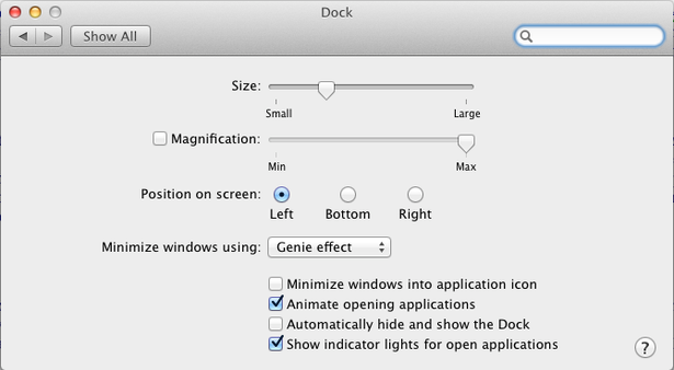
Golly, gee, look at that: you can position the Dock along the side of the screen. As screens get wider rather than taller, a lot of Mac users are switching to a side-Dock instead of a bottom-Dock. I’m sure that there are customizing features in Windows that would ameliorate my problems, but I sure couldn’t find them buried in the morass of junk in there.
Along the way, I found two even more disgusting Skunkies in Windows 7. First, when I was finished with Windows Internet Explorer, I clicked on the little “x” close window box in the upper right corner. That’s how you close windows AND quit programs in Windows. But the window didn’t close nor did the program quit. In fact, nothing at all happened. I clicked again, and again, thinking that perhaps I had goofed. Nope: it turns out that Microsoft, in its supreme idiocy, decided to disable that little square, but leave it in place to fool beginners like me. The only way I could quit Windows Internet Explorer was to go to the 32-pixel icon in the bottom tool bar, click on that, and select the Quit option from the pop-up menu.
The second Skunky also felt like a mistake on my part at first. I wanted to expand the Windows Internet Explorer window. So I whipped the cursor down to the lower right corner of the window. Sure enough, the cursor changed shape to indicate that I was in the correct “resize” location. I clicked, held, and dragged – and the window moved without changing size! “I must have jiggled the mouse while clicking” I thought. Silly me. I tried again: same result. This time I was very careful to get it exactly right, then clicked and dragged. This time, nothing happened. OK, so I tried an experiment: I carefully positioned the cursor with the trackpad and then removed my hand from the trackpad to insure that I would not inadvertently move it. THEN I clicked down. THEN I moved the cursor – and again I got a bad result. After much fiddling around I succeeded in resizing the window, but I have no idea where the correct resizing hot spot is. It certainly doesn’t correspond to what the cursor indicates. It’s also very tiny; just a few pixels one way or the other will miss the hot spot.
So, to summarize my results, tonight’s Skunky award to Windows is actually a triple award:
1. wasted vertical screen space
2. a standard control working in a non-standard manner
3. a resizing control system that demands too much precision of the user.